Nuno Felt

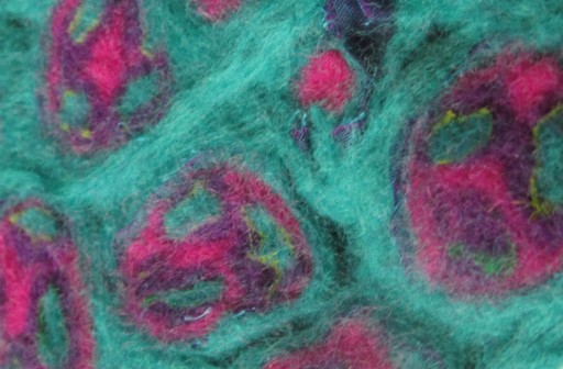
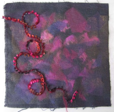
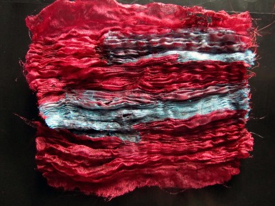
I have been reading ‘Nuno Felt’ by Liz Clay (A&C Black, 2007) and ‘The Art of Felt’ Francoise Tellier-Loumagne (Thames & Hudson, 2008), and thought I’d have a go at some of the techniques I have seen for myself. The picture above is of my initial attempt, felting a lattice pattern of dyed tops wool to a chiffon scarf. The trick is to start with cool water and avoid sudden shocks of temperature to ensure good adhesion to the scarf. As a slightly impatient crafter at times, this was quite a challenge for me. I’m not sure if I didn’t distress it for long enough, but I waas hoping for a little more distortion of the fine fabric. I do like the result though.

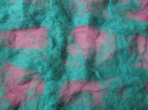
Next I felted some thick braids of tops wool, torn strips of sheer fabric and art yarns. I can see that this may be useful in the weaving project or for couching or tassels.

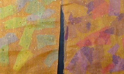
Finally today, I tried making a layered sausage of felt with sheer fabric wraps in between, and with glass millefiore in mind, I cut the wraps into quarter lengths, and wrapped them together in a larger sausage. The resulting felt was then sliced into discs and assembled into a sheet. I was wondering how to felt these together, and attempted it by layering wool tops on the back and between the discs. This was a success in terms of them holding together after felting, but I think I should wrap the sausage in longitudinally arranged tops fibres before slicing and then add tops to the back of the piece, to avoid long fibres running across the front of the work. I could also try dry felting techniques from the reverse.

There is an element of unpredictability in the results of felting, but I think that you can embrace this and be excited by the possible results rather than too frustrated that it doesn’t look exactly as intended.

Final Fabric Manipulation Sample

Rather than using the designs at the beginning of this project, for this sample I decided to use a sketch based on the glass pillars of the staircase in the V&A glasss gallery.

The original sketch was gouache paint applied with a palette knife on A3 paper.

It struck me that the shapes looked like recordings of soundwaves, and the lines at the top looked like music paper. I wanted to develop the idea of sound in my reworking. I have taken more of a conceptial route for development, rather than the approach suggested in our course notes.

I did my next sketch on music paper, and the black marks on top were a hybrid of the pointed marks in the painting and musical notes. As you can see by the notes next to this sketch, I also explored how the various shapes in the original photo and sketch related to sounds, and how they might be portrayed in fabric manipulation.

My initial idea was to mould and stitch a ‘soundscape’, which would be a 3D landscape based on the sketches. I planned to have areas moulded over polystyrene, and smocked areas inbetween. The whole idea became rather complicated, and to work would be better done by working the pieces seperately and patchworking them together. This was not in the spirit of the brief for this project, so I had a complete rethink. I simplified my ideas, and decided that smocking and pleating would be the best way to convey the shapes I was aiming for.


I drew out this very simplified design and used it as a starting point for smocking my calico square. The folds of excess fabric from the smocked areas were then pleated and secured at the edges of the piece. The diamond shapes were lined up in the final sample, as the diamonds would have been distorted otherwise. I worked the smocking in a direct fashion, marking out the spots on the reverse of the fabric in 1cm squares.

From my initial smocking samples on lighter cotton, I enjoyed the mix of smocking techniques working fron the front and reverse of the piece. I like the way that the front facing stitches go some way to define the diamond shapes that are otherwise a little less obvious than I had hoped from the sketch. I am not sure that the final piece is evocative of sound at all, but it was an interesting process to reach the final design. I like it because it is clean and simple, but I worry that it is perhaps too simplistic.


Research Point – Crafts people

In my travels I have spoken to a number of artists and crafts people including a printmaker, a silk weaver, a milliner and a hairdresser. I have found that people who have made a career out of their art or craft generally fall into two broad groups. There are those who set out from an early age with the intention of working in the arts, and those who have previously worked in a professional role (healthcare, teaching, etc) and used art as a way of finding a sustainable work-life balance. At some point there has been a tip in the scales towards moving into their chosen craft full time. One thing they do have in common is a passion for their work, and a feeling of privilege at being able to work in their chosen field. It also seems that even those who set out with the intention of working in a particular field end up doing something different to which they originally intended. Careers have evolved through chance opportunities rather than a predetermined path.

Hairdressing may not be the first thing to come to mind when considering artists or crafts people, but I have recently found the avant garde creative hair competitions an interesting source of inspiration for three-dimensional construction and material (hair) manipulation. My hairdresser is always looking out for new influences and ideas, and in common with other crafts people I have spoken to, an openness to new techniques to try and incorporate into their style. In crafts in general I think there is an interesting dynamic in the relationship between traditional techniques that demonstrate a mark of quality in a specialist field, and a spirit of experimentation to push a craft forward.

Shibori

I looked at “Modern Shibori” by Silke Bossbach, A&C Black 2011 for inspiration before starting this section. Shibori is traditionally worked in silk, with or without inclusions in the fabric to mould shapes. These can be left in place, or removed once the fabic has taken on it’s shape. This small sample was worked in white with polyester machine embroidery thread. I started by wrapping the thread around fabric over a sheathed seam ripper, which was then removed and the wraps tightened.

I moulded damp calico around wooden spheres, and pinned over polystyrene shapes on a foam board. Once dry, the shapes were removed. I wondered how I could work this if I wanted to dye the calico. I presume I would need to prewash the calico, dye it and use dilute PVA to rewet the fabric before moulding.

I then tied fine cotton around small rhinestones with metallic thread. I thought it was interesting making a feature of the thread, and experimented tieing the rhinestones in the right side of the fabric so that they could shine. I have learned that the shapes and forms between the inclusions can be as important as the knotted areas themselves, and attention needs to be paid to the negative space.

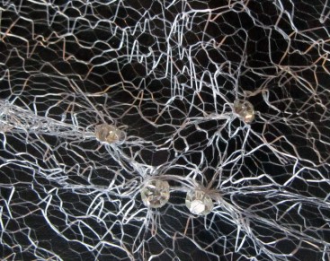
Using a similar technique with small rhinestones in a fine web tulle worked very well.

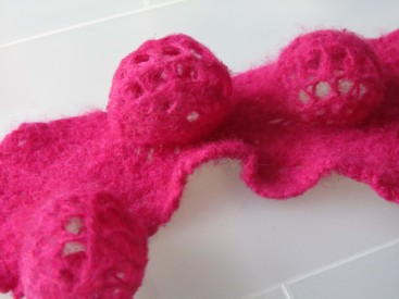
I had a jumper I had crocheted with malibrigo lace yarn that unfortunately never fitted properly (novice effort!). What I was unable to unravel into reuseable yarn has been kept for felting. Here the crochet was tied over wooden shibori beads and felted in hot soapy water by hand. I like the way the lace pattern formed a contrast with the tight felt around the base.

This creates a temporary diversion in my efforts towards ‘slash and reveal’ techniques. At Ferens Art Gallery Open Exhibition in Hull this year, I saw some work by an artist called Sophie Wray, where she had worked synthetic intarsia patches into a natural fibre knit. The piece was then washed hot so that the natural yarn knit felted and shrunk, and the intarsia areas remained unfelted and the same size. I have also been looking at Nuno felt which I wish to try, and enjoy the interplay of fine fabrics against thick felt. I machine stitched my crochet to a sheer fabric, and felted the piece, before slashing it to reveal the bunched up sheer fabric beneath. It would have been even more effective had the sheer been so bunched up that it could protrude through the slashes. I stitched the piece to a calico backing in order to hold the slashes open.

Back to shibori principles, I thought I would experiment with heat tools and consumables. I had bought some heat mouldable mesh, and held it around wooden balls wrapped in foil before heating with a heat gun. I tried wrapping the resulting shapes with polyester organza held in place with wire before melting into place. This was a limited sucess as I wasn’t keen on the appearance of the mesh through the fabric.

I could either use a more opaque material to cover it, or a material more complimentary to the plastic mesh. For my second attempt, I melted plastic vegetable bags around the mesh and felt it was really effective.

Manipulating fabric with stitch

I started this part of this project by reading “Textures Tucks and Pleats”, a self-published book by Jennie Rayment, 1996 bought by Mum at a workshop with the author. It was a good guide to the basic techniques whilst awaiting the arrival of “The Art of Manipulating Fabric” by Colette Wolff. I have worked with pleats, tucks and gathering in my dressmaking constructions, but hadn’t done anything purely decorative like this before. My initial practise pieces were on calico as below, and it was surprising how effective and impressive even a simple design can look.


I thought it would be interesting to see how pleats would look on this multicoloured woven stripe, and was really taken with the end result. It looked at it best when the pleats were ironed crisply before the final lines were sewn, and left unironed after that point. The samples are unfortunately getting a little squashed and distorted as they mount in number.
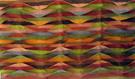
I did this ink sketch based on a photograph of an oil field in the Guardian Saturday magazine, and thought it would look good in tucks. I had to overcome the issue of tucks not traversing the whole sample, therefore needing balancing darts on the reverse. The sample was worked on calico, dyed with procion and ironed after rinsing whilst still damp. This allowed the fabric to settle out even flatter. I liked the effect on the colour, making it more uneven in texture. The tucks were brushed over lightly with an oil paintstick, and additional lines stitched over the top after fixing. This idea could be further developed by layering tucks and colour stages in turn.

Next up was quilting. I have never done any quilting, so used this piece to practise. Having read about Amish quilts, I decided to hand quilt a simple design with a bias binding edge. I like the American crazy quilts, particularly the uneven lines and busy colour themes. I thought that rather than using lots of small amounts of different colours, a small sample could be made to look busier by using very heavily patterned fabric in a restricted colour palette.

I have made some shirred samples, and found that parellel stitch lines, whether they are straight or wavy look similar once gathered, apart from the shape of the fabric at the bottom. The most interested results were obtained from opposing large zigzags as below.

Various fabrics torn into strips and gathered were appliqued in place to produce this sample. I found that the gathering thread should be of similar weight to the fabric or else it can snap at the gathering stage. Different effects could be acheived by twisting gathered strips before stitching the ends in place.

I tried trapping multiple strands of acrylic yarn between pieces of calico by stitching a line, pushing the yarn up to the stitch line, and sewing another line close to it. For the sample on the right I followed the same process, and then stitched a third piece of calico to the reverse, trapping yarn between the stitch lines in another direction.
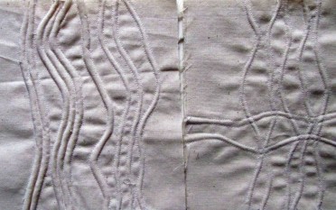
I am lucky enough to have access to a gathering machine I could borrow, which meant that I could practice traditional English smocking techniques with relative ease. The trick is to feed the fabric evenly into the machine without bunching, and using a lightweight fabric. One problem I found was that the needles left quite large holes in the fabric once the gathering threads were removed.

Firstly I tried smocking by hand with a contrasting thread and free wandering stitch lines and knots. I also tried machining over the gathered fabric, which has a lot of potential for textural pieces and would look good dyed. I found that shadows could be created by feeding the working thread in the ‘tubes’ formed on the reverse by the folds. On the right is a sample of North American style direct smocking. I marked the spots on the reverse using a quilting pen (marks removed with heat or friction) before working the designs. I liked the effect of combining English stitches with the thread on the right side with the American style of stitching from the reverse.  I used the book “Smocking Design” by Jean Hodges, Batsford 1987 for inspiration as well as the Colette Wolff book for patterns.


Whilst using the gathering machine, I had the idea of feeding polyester organza scraps in a random and overlapping way to create a patchwork effect. Once on the gathering cotton thread, I then used a heat gun to distress the fabric, hold the pleats and bond the overlapping sections together. Once cool, the gathering threads were removed. I was really pleased and think that I would like to use this technique in the future as a basis for stitching.
Research Point – Straw in Fashion

I have spent time looking at current fashions as part of this project, and I have noticed that straw and weaving are very big this spring/summer, especially for Burberry who have developed their whole range around it. Other fashion houses have incorporated straw and weaving into their hats and handbags, or as accessories in advertising other products. Of course we are used to seeing straw hats and the coarse texture of espadrilles, but we are seeing woven straw uppers on heels too.

With this in mind, and having attended a handbag teaching day earlier this year, I thought it would be interesting to see what straw hats are actually made from, and in line with a previous blogpost, country of origin.

Looking at our own summer hats, they were labelled generically as ‘straw’ or ‘paper’, and where country of origin was in the label, it was unsurprisingly from China. I found the website www.hatsuk.com which has a very useful summary of materials used in manufacture.

Traditionally, straw hats are constructed in one of two ways. Firstly, by coiling up woven plaits of straw, sewing them in place and then steaming the hat into shape. This is how a traditional British boater would be made. The second way is to weave the straw like a basket into a hood shape, starting at the crown, and again steam the hat into shape. Whilst more expensive hats can be made from a hard wearing natural fibre called sisal, jute, wheat or rush; hats from China are more likely to be Xian. This is a popular type of seagrass that can be bleached and stiffened. Other popular beach hat materials are paper panama from Japanese toyo paper which can be dyed, or Madagascan raffia. Panama hats were traditionally made with straw from Ecuador, but are now commonly made with Chinese bleached palm fibre, which can be bleached white or dyed in pastel shades.

Research Point – Amish Quilts

The Amish traditionally made quilts out of a necessity to keep warm during the cold winters, and any aesthetic quality was a secondary concern. They initially used wool batting, replaced by cotton in the mid-19th century until the 20th century when synthetic batting became fashionable. In recent years however, these new innovations have been rejected in favour of cotton. The patchwork designs are typically kept simple and geometric, and colour combinations can be bold. Darker colours were traditionally favoured as the fabrics could be obtained cheaply, and washed infrequently. It was typical to use scraps of fabric or recycle clothing, in line with the ethos of fugility.

The earliest design is the traditional Amish ‘Bar’ quilt, which is simply large vertical wide stripes of 2 alternating colours with a wide border. The quilting stitches are where the detailed patterns lay, using cross hatching, geometric and simple floral designs. Designs then evolved into slightly more complex arrangements that retained a strong geometric and symmetrical quality. One of my particular favorites is the ‘Sunshine and Shadow’  design which uses the juxtaposition of small squares of contrasting colour and tone to great effect.

By the 1960’s, quilt makers had begun to incorporate more figurative designs into their work, reflecting images from every day life such as baskets, flowers and the schoolhouse. In the early 1960’s the idea of producing quilts commercially to sell to visitors became popular, and there was more widespread use of patterned fabrics as well as more technically complex designs. The ‘Starflower’ design has a central dahlia, whose petals are depicted with gathered fabric. As Amish communities had more contact with outside ideas, they started using other techniques such as applique in their work.  Quilts are traditionally finished with a wide band of bias binding and a plain backing fabric.

Thinking about consumer concerns in our society relating to bedding, there seems to have been a seperation of the aesthetic ‘function’ served by a traditional quilt, and the duvets that we tend to sleep under. Fashion has moved towards seeking technological advances in the duvet itself in order to regulate body temperature. Some claim to draw heat away from the body using microfibre technology, and store that heat to keep you warm enough throughout the night. The past decade or so has seen clothing chains such as Monsoon, Next and Laura Ashley move into the home decor market, and producing duvet covers that incorporate embroidery, applique and lace to give a more opulent, craft-based feel than the printed cotton covers of the late 20th century.

Reference: “A Quilter’s Guide to Amish Quilts” by Jan Jefferson and Maggi McCormick Gordon (Collins & Brown, 1998)

Layering fabrics

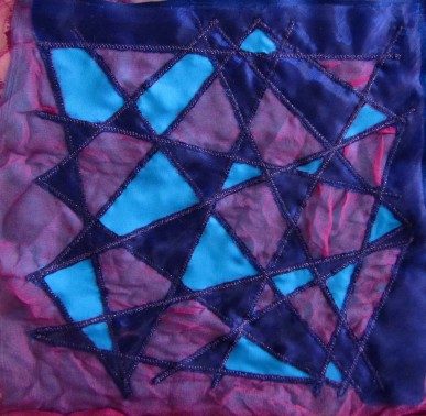
Continuing with the applique and layering section of this project, I tried layering a combination of sheer and opaque fabrics and cutting back sections. I found that satin stitch held better than straight stitch, and I thought that straight lines would be easier for a practice piece than curves. I tried to be a bit clever by keeping the mauve sheer layer slightly uneven as I enjoyed the shadows created by the folds in it. The other layers were ironed, and all 5 layers were tacked in a gridlike fashion before sewing. I hoped that this would ensure the folds in the mauve layer were even. It was a partial success but very difficult to cut back avoiding folds in the very fine sheer. it was interesting to see the effect of the border being cut back, negative shapes becoming positive.

In this sample, I bonded a sheer to a black cotton with bondaweb, trapping pieces of sheer fabric and teased out silk rods in between. The bondaweb was painted with a gold interference acrylic ink prior to bonding. The result was a little flat, I think because of my choice of top fabric. The couching wasn’t really a success in lifting it either. I may have been better to use the bondaweb painted side down to the black, trapping the pieces and omitting the top sheer layer.

I moved on to using heat tools for fusing fabrics, as demonstrated in Margaret Beal’s Fusing Fabrics. I tried fusing pieces in a sheer fabric sandwich with small soldering marks, but the result was quite messy like this. More thought needs to be given to the fusing marks used as I didn’t realise they would be so prominent. The piece on the right was fused with small torn pieces of bondaweb, but I felt the glue was too visible.

I liked the idea of bonding the trapped fragments by cutting and fusing in a patchwork style. Rather than starting again, I used the piece with the unsuccessful marks, so ignore those please! Having practised I now have a feel for what speed to move the soldering point along the ruler and have got used to the fact that you don’t really need any pressure on the tip.

I then tried cutting out shapes. Here I used a coin and ruler to create the leaf/petal shape. I bonded shapes to kunin felt and used stitch to applique. I really like the crispness and depth of the resulting edges.

Also as part of this exercise, it was suggested we experiment with Tyvek. I did some quite formalised experiments with a heat gun and pyrography using different weights of Tyvek and Lutrador in order to understand how they behave. Below is the most interesting of the pieces I went on to make, I painted one side with shades of green, and silver on the other. I then machine stitched with green cotton and distressed the pieces with an iron using varying pressure. Pressing rather than hovering results in a lacier piece. I’m not sure that I particularly enjoy the aesthetic of Tyvek, but can see that it could be a useful base for interesting textural pieces.

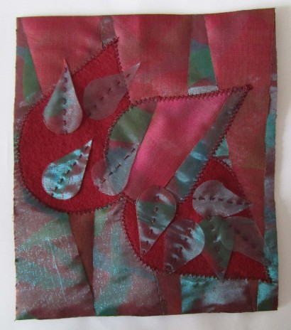
For my final applique sample, I took colour inspiration from the peeling tree bark, and the design from my flowering tea development work. I decided to use kunin felt rather than calico as a base, as I wanted to use the soldering techniques I had learnt to create a background that reflected the long petal shapes of the tea. This was reflected in both the long thin pieces trapped in between sheers, and the chevron patchwork design. I used two different sheers for the sandwich and inverted half of them to create the pattern. Although the brief suggested fine threads, I chose a heavier toning thread to ensure the shapes stood out enough against the background. I messed up the applique as the fusing seperated slightly at the base of the petal causing puckering at the tip. The smaller petals were cut from a mixture of the sheers sandwich, and the blue organza alone. I am really pleased with the piece, and accept that it is not perfect because I tried to push myself technically.

Research Point – Textiles Today

As an introduction to this research point, I have read ‘Textiles Today’ by Chloe Colchester (Thames & Hudson 2007), and it has been fascinating. The main part of the book investigates the interaction of textiles and science, particularly in relation to medicine, the military and architecture, but the thing that has really stayed with me is rather closer to home. I like to think of myself as quite environmentally and ecologically aware, but I am ashamed to say that I hadn’t really given much thought to the origin of my clothes. I make a lot of my own clothes, and having written about my home-sewn dress in a past blogpost, it occurs to me that I have no idea where the fabric was produced. I now assume that it is probably from China. The yarns that I buy tend to be imported from South America, although looking at the Fyberspates website, they buy from the UK, Peru, Italy, Spain and the USA.

I had a look through our bought clothes to look for country of origin, and was quite surprised to find no information about this on some labels, particularly the more expensive brands such as Diesel and Fauve underwear. In terms of underwear, synthetics tended to be from Tunisia, and cottons from Sri Lanka. Leggings and Jeans were from Turkey or China. All knitwear was sourced from China, with the exception of one British jumper of my husbands. Printed items such as skirts all came from China. My T-shirts were as follows, by brand:

  • Monsoon – Romania
  • White Stuff – Portugal, India
  • Peter Storm – China
  • GAP – Jordan, Bulgaria
  • Dorothy Perkins – Mauritius
  • Miss Selfridge – Turkey
  • New Look – Bangladesh, India
  • Peacocks – Bangladesh

Our towels are all from Portugal, and bedding from China. I am assuming that the country of origin refers to the manufacture of the fabric and the final product, but can’t be sure.

I have found this exercise quite illuminating, and given the environmental impact of manufacture and import miles, I feel even more strongly that I would like to focus on developing a wardrobe of items that last well rather than following the fleeting fashion of the season, and looking more at second hand items. This sits well with the current move towards vintage, but I think that the motivation for this in most people’s cases is one of fashion rather than environmental concern or finances. There have been many press articles about seeking out vintage items and saving money as we are in a recession, and to champion recycling, but shops and magazines are full of ‘vintage inspired’ fashion and furnishing. I think that we are experiencing a move towards homely patterns, natural materials and craft based objects as an antedote to the stark minimalism and synthetic-laden 1990’s. I love vintage styling, particularly from the 1930’s to 1960’s and we have furnished most of our home with found items. Part of the appeal of this is to develop an individual ‘look’ made up of objects we love. In the world of Cath Kidston everyone ends up looking the same again.

Applique samples

Continuing on through this project, I have been doing some more design work based on my sketches. For my themed sketchbook I have been sketching flowering teas, and liked this simple design from the central stem in the tea. I did lots of work with the simplified ink drawing by photocopying it 8 times, cutting it out and developing patterns by re-orientating and tessellating them. Rather than sticking down the designs, I photographed each pattern and reused the same pieces.

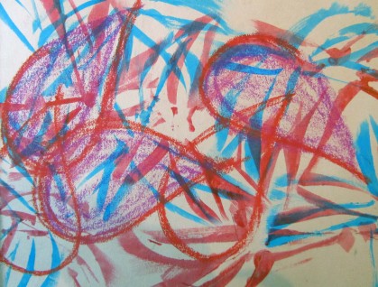
I also played with taking the individual shapes in different scales to create two more organic, less orderly pieces. The first used the long petals as masks painted over with acrylic ink, then oil pastels drawing the rounder large petals on top. The second is a collage of tissue and photocopies of the original ink drawing.
I then moved onto making fabric collages. Again I began by laying out strips and squares of fabric and photographing them to see what was working. I used the colours from my green/blue and red bark sketches for this.

Although I liked the bright light blues and greens with the dark red and orange in the sketches. I was having trouble uniting all the colours in small samples without it looking cluttered. Saying that, looking back at the photo above it didn’t look too bad!

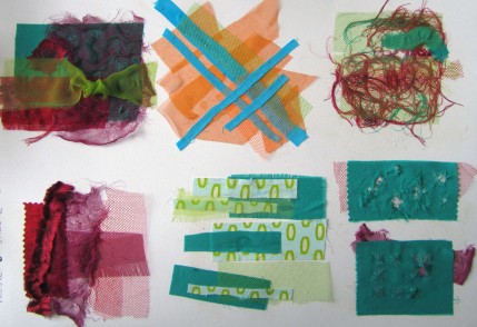
I tried a few different things here, the blue against orange in strong lines for maximum impact, using coloured nets to conceal and reveal in turn. My favourite piece is top left. The fine sheer burgaundy fabric was pulled and stretched to distort the weave, and although I omitted any blue from the design, the dark red on blue/green does look slightly blue in places. I like the idea of simple manipulation of the light sheer by adding a loose knot. It gives a focal point and varies the opacity through the fabric in one move. In the lower left piece I looked purely at the qualities of different fabric compositions and really liked the torn and stretched satin strip to the left. Centre bottom I wanted to look at how patterned fabric could be successfully used without looking too cluttered. Keeping the cut shapes and design as simple as possible worked best. Top right I was playing with using the left over threads from other pieces with sheers to make a new fabric. Bottom left was looking at slash and reveal – random uneven cuts over a very regularly woven sheer beneath (synthetic net), and more ordered regular cuts over an unevenly woven sheer.

Relating back to the sketches, I think the top left piece was most in tune with the original colour inspiration, but I think I have successfully moved each sample on from the sketches to explore different aspects – colour, textures, the fibrous peeling of the bark.

Now to the applique samples! For the hand applique I wanted to do a sampler of different fabrics and techniques. I took the simple petal shapes from the tea drawing for this. I used printed cotton with a seam allowance and slip stitched edges, satin with bondaweb and blanket stitch, felt with running stitch following the contours of the shape, cordouroy with running stitch along the grooves of the fabric (minor fraying allowed), a matt sheer with bondaweb and blanket stitch, and printed cotton with bondaweb and blanket stitch. The net shapes were sewn on top with black thread in a stitch line outlining the positive shapes of the net and negative shapes around the applique pieces beneath. I found the applique with a seam allowance a bit bulky and difficult to get a sharp point at the top without showing any raw edge. This would be better with shapes with no points, and for padding bases for stumpwork. The bondaweb under the very light matt sheer didn’t really work as you could see the glue. In the design, I like the way the overlapping nets create new shapes that echo the positive shapes.

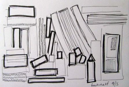
For my machine sample I used this simple outline sketch of the shapes of things on my bookshelf. Yes – my shelves are rather cluttered!

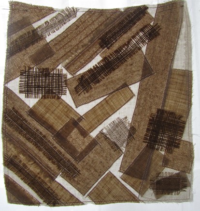
I used all neutral fabrics of differing weights and weaves to make this piece, and overlayed areas with a semi-opaque tulle. This looked really good up against the window. I used a combination of satin stitch with concealed edges, and straight stitching with fraying. I finished the piece with a few lines of zig zag and straight stitch as suggested in the original sketch.