Walthamstow Tapestry, Grayson Perry

I recently had a weekend in London, and got to see Grayson Perry’s Walthamstow Tapestry at the newly refurbished William Morris Gallery. The visit fitted really well into this assignment as I have written research points on both men.

Copyright The Metro 2012

This tapestry was the first of his large scale tapestries completed in 2009. It has been woven on a computerised Jacquard loom, meaning that the massive 15m long piece can be completed in one and a half days!  Tapestry would not be a very practical medium for Perry if such technology were not available, as the content is so politically satirical, it is immediately relevant to life today.

I spent an age looking at this work as the more you look, the more detail you see. The first this that strikes you about it is that it looks incredibly colourful, but on closer insepction the colour palette is actually very narrow. The way that the piece is displayed on a curved wall works very well, as there are parallels between the start and finish of the narrative. We have birth at one end on a simple quilt, and death at the other on a second quilt design. The river of blood runs around the top, and the yellow brick road around the bottom. The thought processes were all set out on the written panel accompanying the exhibition, but the themes were quite easy to follow without this. The edges of the tapestry are drawn in a freehand and loose style which is characteristic of Perry’s tapestries.

The tapestry is littered with age-relevant trade names and observational depictions of modern life, but any perception of prejudice comes from the viewer and what they project onto the work. I wondered if this was another reason that the piece seems so colourful, as we imagine all the trademarks and logos jumping out from the wall.  Floral motifs are dotted across the tapestry, a nod to William Morris and a device to mirror the health of the subject as they move through life. We even have fleur-de-lis urinary incontinence near the end.

One thing I did notice was a wrinkling of the tapestry that looked like sagging of large blocks of one colour. I think that this is always going to be a problem when large areas of one colour are used as I think it is owven like a double cloth, and the colour changes anchor the top layer to the back.

The rest of the museum is well worth a visit, and it was lovely to have the things I had previously written about illustrated with the actual artefacts. Seeing a recreation of the Morris and Co showroom was a particular treat.

During the weekend, I also made time to visit a few other exhibitions. Spare Parts at the Rag Factory was about prosthetic limbs, half of the space devoted to new technologies and designs and the other half was art incorporating discarded prostheses. The Wellcome Trust had an exhibition called ‘Superhuman’ about human augmentation in general, and another ‘Medicine Today’ which was an interesting mix of art, design and medical sciences.


Final Weaving Sample

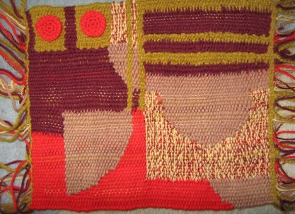
Having found an image and made a yarn wrapping I was particularly inspired by, I decided to make a weaving that was midway between the two sample briefs. I wanted to make a representation of a design I found pleasing, but was also interested in the interplay between warp and weft brought about by a looser weave than a tapestry.

This is a postcard of a book cover that can be found in the Bodlean library. I love the contrast of curved and square geometry as well as areas of high and low contrast with adjacent shapes. The yarn wrapping was made with a selection of DMC tapestry wools, acrylic yarn and a chunky alpaca Rowan yarn for the gold. It is only after I started to develop this further I realised I seem to have an ongoing  definite Bauhaus leaning! I visited a friend’s house where they have a woven tapestry displayed that they bought in rural South America. The chunky alpaca was reminiscent of this for me, both in colour and texturally. A notable thing about that tapestry was that the warp had remained quite visible, although was of undyed cotton and not part of the design.

I decided to take a quarter of the design to sketch, as I wanted bigger shapes in my piece, and felt that the asymmetry would create more tension in the design.

I  then transferred the design onto graph paper with watercolour, having already painted watercolour stripes inspired by the yarn wrap for the warp. Never to make life easy for myself, I decided to tackle perfect circles and straight seams in my weaving!

You can see on the sketch above that I also played around with how to present the fringing. I decided on plain knots in pairs finally as it worked well to draw attention to the warp design. Rather than weaving the smaller red circles, I decided to stitch crochet circles instead. This came finally out of a discussion at West Dean about surface embellishment and ornamentation, and partly to solve the problem of squaring off of curves once the design becomes too small. In terms of yarn selection, I used one strand of chunky yarn and 2 strands of other yarns to keep the picks level. I also substituted the pale yellow with a strand each of warm yellow acrylic baby yarn and shiny copper synthetic yarn. This was in order to create a contrast of textures and solid versus broken colour.

The alpaca chunky made a really solid heading cord, and having a coarser surface texture meant that it gripped to the chunky warp yarn making it stable. The weaving process was quicker than my other samples as I was following a pattern, but I was held up significantly by a long wait for out of stock yarn. I had really underestimated how much yarn I was going to need given that I was using it 2-ply. At the beginning of the weave, I checked the scale of my weaving by checking that a square on my paper design was a true square in the weave. This was important to ensure that the circular elements of the design worked. I was really happy with how the variation in thickness as well as colour in the warp worked with the weft design and felt that it carried the stripey elements of the design through the piece. In the stripey part I took the advice of the weavers at West Dean and alternately used interlocking and slit techniques where the colours met. Unfortunately, having three slit seams in one pick caused a widening of the weaving in this part. This was particularly annoying as I had been really pleased with how even my tension at the selvedges had been on the loom!

I have got the weaving bug and having read Margo Selby’s book of designs, I would move on to experiment with different lifting patterns, and how this could work with mixtures of textures as well as colour. I feel I have an understanding now of how an inspiring image or feeling can be interpreted into weave.


Research Point – Textiles in Fine Art

The final question in this research point is whether I think that textiles has been accepted as a medium by the fine art establishment, or if it is predominantly viewed as a craft discipline. Personally, I think that when confronted with a piece of textile art, I view it in the same way that I would view other media. The main question is really concerned with definitions, and whether craft and art are defined disciplines with little overlap.

My personal view is that there is a traditional snobbery towards craft as opposed to art as historically fine art was commisioned by the wealthy. The rich and able could portray their version of the truth, whether it be about personal attributes, family values or political motivations to the masses. Crafts had their origins in the community and could be used as communication from ordinary people to each other or the wider world. Some examples of this use of craft as communication are discussed in ‘Textiles: The Whole Story’ by Beverly Gordon (Thames and Hudson, 2011). I was particularly inspired by the story of  ‘apilleras’, political pictorial embroideries produced by women in Chile depicting horrors under Pinochet’s rule. These embroideries were smuggled out of the country for exhibition in the rest of the world, highlighting their plight and providing an income for their families. If the purpose of art is to be thought provoking, challenging and pushing a medium, then apilleras would fall well within that definition.

Textiles is still in it’s infancy as an artform. Beverly Gordon goes on to describe the rise of textile art in the 1970’s, fuelled by increasing world travel and experiencing traditional textile techniques first hand, and second wave feminism with a renewed interest in traditionally feminine work. New terms were coined for work produced such as ‘soft sculpture’ and ‘wearable art’ and materials used have become more novel and techniques pushed into the realms of freeform. The message can be portrayed in the materials used, or the use of traditional techniques and materials can be used to create a tension with disturbing content. There is a feminist argument to be had that soft forms and textiles are viewed to have a lesser value compared to more traditional fine artforms exactly because of their association with women’s work and decoration.

The question of when a craft becomes an art was discussed on the Tate blog here. Prompted by The Power of Making Exhibition at the V&A, Grayson Perry’s ‘Tomb of an Unknown Craftman’ at the British Museum and Ai Weiwei’s exploration of traditional craft techniques, the comments on the blog seemed broadly to be asking ‘Do we need to make a distinction?’.  Grayson Perry is an interesting case in point as he is accepted as an artist by the fine art establishment, championed by Saatchi and winner of the Turner Prize, but as the title of his recent exhibition states his concerns are well within the craft umbrella working with ceramics and textiles. Other high profile artists such as Tracey Emin are starting  incorporating textiles into their work (see my blogpost on West Dean Tapestry Studios), but it would still be a rarity to see a show dedicated to textile art in a national fine art gallery, let alone a single textile artist.


Stage 3 – Experimenting With Different Materials

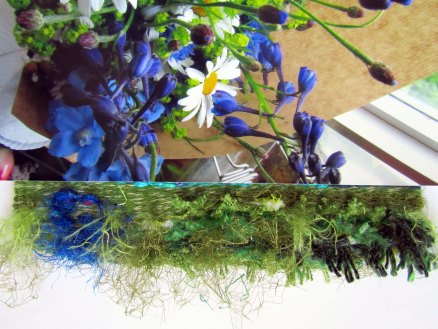
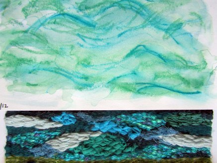
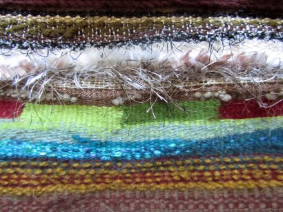
I had jumped ahead of myself a bit and already played with a wide range of materials and techniques in my first woven sample, so for this piece I worked from a number of my photographs and sketches to use what I had learned to convey the feeling of each image.  I used a heddle which made the weaving process a little quicker and helped to keep the width of the tapestry regular, although the warping process was tricky. The warp needed to be wound in smaller sections meaning that I had to take care to keep the tension even as I went rather than being able to adjust it all at the end.

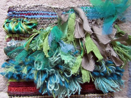
In this first sample I used a picture of a bouquet of local meadow flowers. As well as the image itself, I wanted to convey the feeling of a meadow. The background was made up of woven and knotted coarser textured wools, frayed fabrics and netting with frayed bright blue silk and white yarn/yellow netting to convey the flowers. I wanted the flowers to be slightly obscured by the green and have quite a deep pile.

The next section was based on a sketch of the sea on a slightly rough windy day. I used eccentric wefts to add movement, and contrasting sections both in texture and tone to break up the image. In the paler areas I used the soumak style chain stitch weave in alternating directions to echo the waves in the rest of the piece.

This is a photograph of a wet textured wall on Portland. I used a combination of frayed silks, gold tissue paper, metallic ribbons, glossy braiding cord, plastic netting and various other textured neutral yarns. I put a section of Soumak weaving with the glossy braiding cord to portray the wet bumps on the wall which worked very well and provides a focal point.

The final idea was based on some rusted metal ropes on a crane on the cliff. I built the weavings in diagonal sections outines by 2 picks of a black sock yarn. I worked two layers of ‘rope’ in this way, with some areas more solid in colour and texture than others. Although the weaving ended up looking quite different to the source material, I was pleased with the way it turned out as a stand-alone piece.

For the larger section I chose to develop the meadow piece, widening the combinations of yarns used in a single Ghiordes knot, and using two different approaches to portray the blue flowers. The piece isn’t hugely different to the first section, but I feel it could work well on a larger scale with quieter areas incorpoated into the design.

In summary, I am happy that I used my experiences in the initial experimental woven sample to work directly from source materials and develop ideas.

William Morris

During this project on weaving and looking into the work of other artists and designers, I wanted to do some research on an artist whose designs have always captured my imagination, William Morris. I have read two books on the man and his work, namely “The Beauty of Life: William Morris and the Art of Design” edited by Diane Waggoner (Thames and Hudson, 2003), and “William Morris: Décor and Design” by Elizabeth Wilhide (Pavillion Books, 1991).

William Morris (1834-96) was known for his work in many fields including wallpaper and textile design and manufacture, poetry, calligraphy, publishing, architectural preservation and socialist politics. As well as being credited as the founder of the Arts and Crafts movement, he was also offered but declined the poet laureateship.  With fellow artists Dante Gabriel Rossetti, Ford Maddox Brown, Edward Burne-Jones and other artists, architects and furniture makers he founded Morris and Co. (“The Firm”) in 1861. The Firm produced stained glass windows and later other interior designs incorporating geometry and flowing depictions of the natural world, with Morris’s consistent philosophy of design to bring beauty to the lives of ordinary people.

Morris was one of the first designers to make the connection between form and function, beauty and usefulness. He worked in a holistic way, and when designing patterns would always keep in mind how the pattern would be printed or woven. In the early days of mechanisation he talked about “avoiding  the trap of trying to make your paper look as if it were painted by hand”, instead recognising the limitations of machine and artfully reducing shading and limiting colour palettes.

The Green Dining Room (now the William Morris Room), V&A Museum, London

He was a scholar and spent many hours researching historical world textiles and techniques in the South Kensington Museum (now the V&A), and illuminated scripts in the Bodlean Library in Oxford. His work was particularly influenced by 16th and 17th century Italian woven silks and medieval tapestries. Some of the Firm’s most well known commissions are the Green Dining Room at the V&A and the Armoury and Tapestry Room at St James’ Palace.  Morris also worked in collaboration with De Morgan who worked with similar motifs and went on to be a prominent ceramicist. Morris designs capture the essence of traditional designs without copying them, and he was known for his dislike of reproductions.

A rare ‘Swan-House’ Hammersmith hand-knotted carpet, Morris & Co. , c.1890 (textile) Courtesy of Bridgeman Education

He was experimental in his work, and with his deep knowledge of Persian, Turkish and Chinese carpet making built a loom and experimented with hand-knotting techniques. At Merton Abbey, these techniques were adapted to produce tapestries for the Firm, and most of his employees were former Spitalfields weavers. His textiles and wallpapers were hand printed, and dissatisfied with modern chemical coal tar dyes he worked with George Wardle of Staffordshire to revive natural dyeing techniques. His preferred technique of textile printing was to discharge print indigo dyed fabric, and block print with natural dyes using different blocks for each colour. His most complicated pattern to print was “Cray” which used 34 separate blocks!

‘Cray’, 1884 (printed cotton) Courtesy of Bridgeman Education

I was surprised to find that a number of designs I had always associated with William Morris were actually from the firm Morris and Co., and designed by Morris’s friend, colleague and chosen successor as artistic director J.H.Dearle.

Yarn Wrappings


Since the start of the yarns project, I have continued to make yarn wraps based on places we have been or source material that gets my attention. Here are a few examples. The first two are postcards from Salisbury Cathedral, and the last one is a bookmark from the Bodlean library in Oxford.

Project 9 – Woven Structures

Having read some general basic weaving how-to guides, I set about making my loom. I had an old box canvas that I adapted by cutting off the canvas and removing the cross bars. The result isn’t quite as sturdy as a hardwood frame, but perfectly suitable for this project. I marked it out as instructed in our course notes and warped up with a medium thickness buff colour cotton. Fortunately the art shop behind our house is home  to the town spinners and weavers group, so they stock all I need. I have 4 shuttles and a shed stick. The warping up came together quite quickly as I wound it stright off the reel. I used the same cotton to weave a heading cord approximately 5cm up the frame.

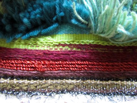
I started plain weaving with acrylic sock yarn, creating stripes and squares before moving on to mixing weights of yarn. I was able to weave textured spots with single picks of chunky alpaca yarn. I then tried creating upward and downward curves using a mixture of plain weaving and eccentric wefts. Again I mixed textures using shiny and matt yarns, and used dots of colour in places as shading. It did take careful attention to avoid tightening or loops at the selvedges, and I did find that until a fairly large amount of weave was completed, the heading cord had a tendency to slip as it failed to grip tightly enough to the warp. Lifting the shed stick made weaving one way very quick indeed, but I found picking individual threads from behind quite labourious for the alternating shed. I tried tying loops to a second shed stitck to lift the alternating warp having read about ancient looms and techniques in “5000 Years of Textiles” from the British Museum, but the loops had to be exactly the same length for this work properly.

I wanted to explore different ways of dealing with vertical lines, and having read up on this I tried the 3 main methods – slit tapestry, interlocking weaves and dovetailing. This was very similar to intarsia colorwork in knitting. Slit tapestry was the preferred technique of the Navajo weavers and usually requires stitching from the reverse after weaving either in single knots creating a buttoned look, or a continuous stitch. It gives a very clean and solid demarcation of colours. Interlocking stitches also gave a strong line, but you have to be careful to keep the order of weaving and twisting consistent to avoid a jagged line. Dovetailing gives a soft blurring with a slightly raised edge, but is very neat and simpler to acheive. Across a whole weaving it does mean that vertical stripes need to worked simultaneously rather than in turn which slows down the process.

I then got a bit more experimental with yarn choices, using Habu textiles pom pom and textured fine yarns, hemp string, audio tape, fine metallic ribbon and eyelash yarns. I found the more rigid yarns such as string harder to weave without causing distortion and tightening at the selvedges.

Next I explored Soumak weaving techniques with a merino/silk blend, metallic synthetic yarn and acrylic sock yarn. I loved the thick structure that formed and experimented with working the loops around one or two warp threads, and using a contrasting colour between the looped picks. this only worked when smaller loops across single warp yarns were used, unless the number of plain weave picks between was increased. I used the Soumak rows for shading, progressing across a single pick from wide loops to narrow loops to plain weave. The traditional technique was essentially a stem stich worked over the warp, so I thought I would experiment with a different linear stitch. Chain stitch was really effective both as an isolated pick where the chain structure was more obvious, and as a block. A different look could be achieved by keeping the direction of chains worked the same or alternating directions.

I moved onto experimenting with rug making techniques and the individual and continuous Ghiordes knots. I tried blending different yarns in single knots, and mixed leaving loops uncut or cut. I tried using strips of netting, sheer fabric, sari fabric and frayed hessian. A section of continuous looped knots with striped ribbon was particularly effective. In the plain weave picks I tried weaving with fabrics and materials including dress fabric, netting, vegetable bags and plastic carrier bags.  The thicker the woven material in the weft, the more visible were the warp threads. The warp threads can be made less visible by setting them wider apart.

Research Point – Michael Brennand-Wood

‘Transformer’ 2012 (Bluecoat Display Centre)
Copyright the artist

I first became aware of Michael Brennand-Wood‘s work first hand at ‘Lost in Lace’ earlier this year. I have since seen many examples of his pieces in textbooks from our reading list. I have also seen his collaborative work with weaver Philip Sanderson (Creative Director at West Dean Tapestry Studio) at COLLECT 2012 and have been lucky enough to speak directly with both Brennand-Wood and Sanderson about the work.

‘Flower Head- Narcissistic Butterfly’ 60 dia x 40 cm, 2005.
Copyright the artist.

Brennand-Wood is an artist concerned and interested in wood and textiles, and the interplay between two and three dimensions which he explores in his works. He has a strong belief that good textile art comes from a deep understanding of technique and textile history.  He has mainly produced pieces that I would describe as three dimensional collages using small machine embroidered samples on straight pins with a wood base. He has looked at floral forms as well as lace, and more recently has produced larger scale collages and tapestries relating to war and conflict. He has also done a number of large scale commissioned installations for various organisations, including Royal Aberdeen Children’s Hospital in Scotland.

In an interview earlier last year with Diana Woolf, Brennand-Wood talked about the origins of his career as well as his feelings about his art. He describes the rhythms throughout each piece created by use of strong contrasting colours, patterns and an illusion of space. His work can be read on many levels, and he does use the titles of his work to point people in the right direction. He references the history of textiles in all of his work, and has gone through periods focussing on embroidery techniques, pattern development, floral designs, and lace. Technique is hugely important to him, and he had a traditional approach to his work in that he produces all his own work, using computerised embroidery only some of the time.  I read his recent pieces about war as being quite anti-war and had a strong emotional response to them. He plays down the anti-war theme, but instead focusses on the euphemism around war and the sadness that comes out of conflict. He started by developing motifs into flags, but has recently moved on to make two medal shaped pieces, one of which is from toy soldiers, cut-outs of planes and woven strips.

‘Meddle – Memento Mori’ 2012 Bluecoat Display Centre
Copyright the artist

I am now feeling rather fantastically lucky as my husband has just bought me this brooch on a display panel!!

Textile brooch on panel with found objects (approx 15x15x5cm). 2012 Michael Brennand-Wood
Bluecoat Display Centre

References:

http://brennand-wood.com

Press Release April 2012 – West Dean Tapestry Studio Collaboration with Michael Brennand-Wood for Collect 2012

http://www.themaking.org.uk/content/makers/2011/02/michael_brennand_wood.html

Cole, D. ‘Textiles Now’, 2008 Laurence King


West Dean Tapestry Studio

This week I went on a day trip to visit the West Dean Tapestry Studio near Chichester. They open for half an hour a week for a short tour and Q&A session on weaving in general and their current work. The studio opened in the 1970’s to work on a commission from Mary Moore to create a tapestry from a drawing by  her father, Henry Moore. They have been working on their current commission from Historic Scotland for Stirling Castle since 2008.

The tapestry I saw being woven is on a large low frame loom, and the cartoon has been printed on a large scale from A4 transparencies. The cartoon lies behind the warp, and the lines transferred onto the warp thread with pen as they go. Sections of the cartoon are printed on a slightly smaller scale in sections and a plan for colour matching marked out every month. They try to use a restricted palette (100 colours across this one tapestry and 250 across the four) and sections may be pulled out and rewoven as they go if it doesn’t quite work in life.

Gold thread has been used in small areas, and they use a rather costly 2% gold thread as the modern metallic machine threads have a tendency to fade. The warp is of mercerised cotton rather than traditional silk as modern silk does not have the same longevity as in the past. Wooster wool is used for the weft. These large scale tapestries are traditionally woven from the back, but in the 1980’s the decision was made by the studio to work from the front. Part of the reason is that modern tapestries use more blended wefts to create a more painterly effects. Different tones are blended within the same weft, and in one particular example up to 13 ply were used in a single weft on a wide setting to create a gradual movement of colour. One such contemporary artist collaboration was with Tracey Emin, which are currently on display at the Turner Gallery in Margate.

‘The Black Cat’ Copyright Tracey Emin, image from West Dean website

We saw some samples being woven for artist Michael Brennand-Wood, cartoons for which I recognised immediately from a tapestry I saw at COLLECT 2012. They were working on trying to convey the feeling of smaller machine embroidery samples he had done. One problem was how to get the effect of the bobbin thread showing through slightly on a black and white sample. The solution was to alternate double picks between a fine black yarn and a much thicker white yarn. Skulls were being woven with a raised black outline, achieved by couching with weaving over thick rope lying on top of the warp. Another trick I picked up was to use a heavy card template in the warp at the bottom to outline the lower edge of the work. Ends were dealt with by tying together and sewing back under an appliqued backing calico. We also talked about ornamentation of tapestries with badges an other ways to enhance the surface qualities of work.

Research Point – Diana Harrison

Drawings on Cloth

I first encountered Diana Harrison’s work at the ‘Lost in Lace’ exhibition this year in Birmingham. Some of her work also features in Drusilla Cole’s book ‘Textiles Now’. I am particularly drawn to the Japanese aesthetics of her work, and the way that process features so prominently in the finished pieces.

Box 1 and Box 2, shown at the V&A Museum in 2010

Harrison studied at Goldsmith’s under Constance Howard, and her work mainly consists of heavily stitched, screen printed, and quilted pieces. She starts by bonding layers of wadding, cotton, interfacing and pre-dyed black silk, and then machine stitches a dense network of lines with polyester thread. She layers discharge printing, screen printing and devore paste printing to alter the surface quality. The combination of synthetic thread on silk and cotton fabric means that devore paste can be used to leave a mesh of stitches in places. She used this technique in the piece ‘Line’ at Lost in Lace, and it fits with her focus on the stitching becoming an integral part of the fabric. Her colours are muted natural tones that enriches the atmospheric shading of her work and focusses your attention on the textural qualities of the piece.

She is inspired by repetitions of line in daily life, such as road markings, and found objects on her daily journeys. She is particularly moved by the weathered patina of found objects, and ‘Box 1 and Box 2’ above are inspired by cardboard box found when she was out walking. ‘Box 1’ is the size of a bed as it was made to closely resemble a quilt for a four poster bed with the open faceted corners.

References:

http://www.clothandculturenow.com/Diana_Harrison.html

http://www.vam.ac.uk/content/videos/b/video-box-by-diana-harrison/

Cole, D. ‘Textiles Now’, 2008 Laurence King